
Illustrations, graphics and marketing campaign for the new national warning and information system LU-Alert
We were given the exciting task of developing an information and awareness-raising campaign for the new national alert system, which was officially introduced by the Luxembourg government in October 2024.
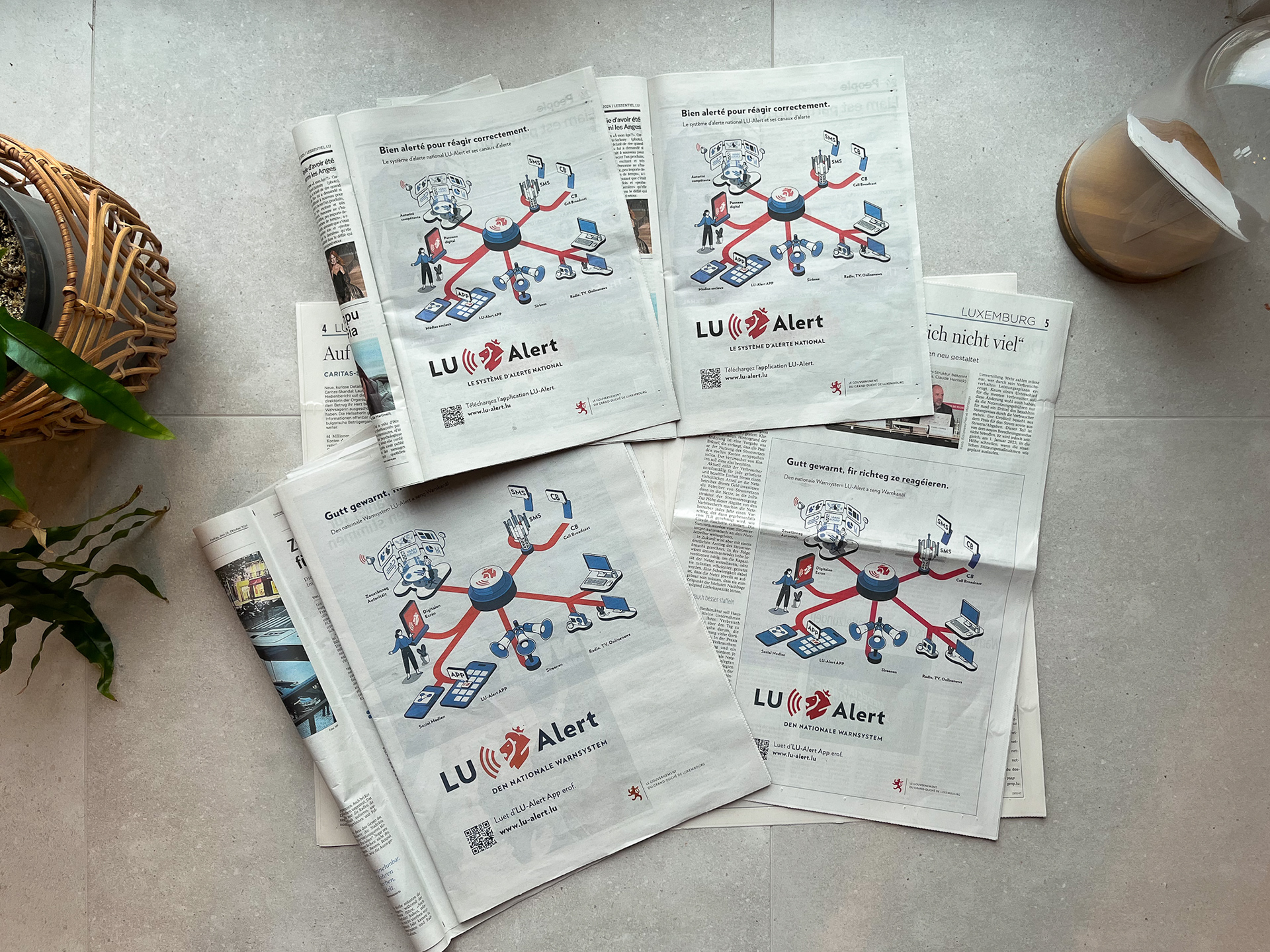
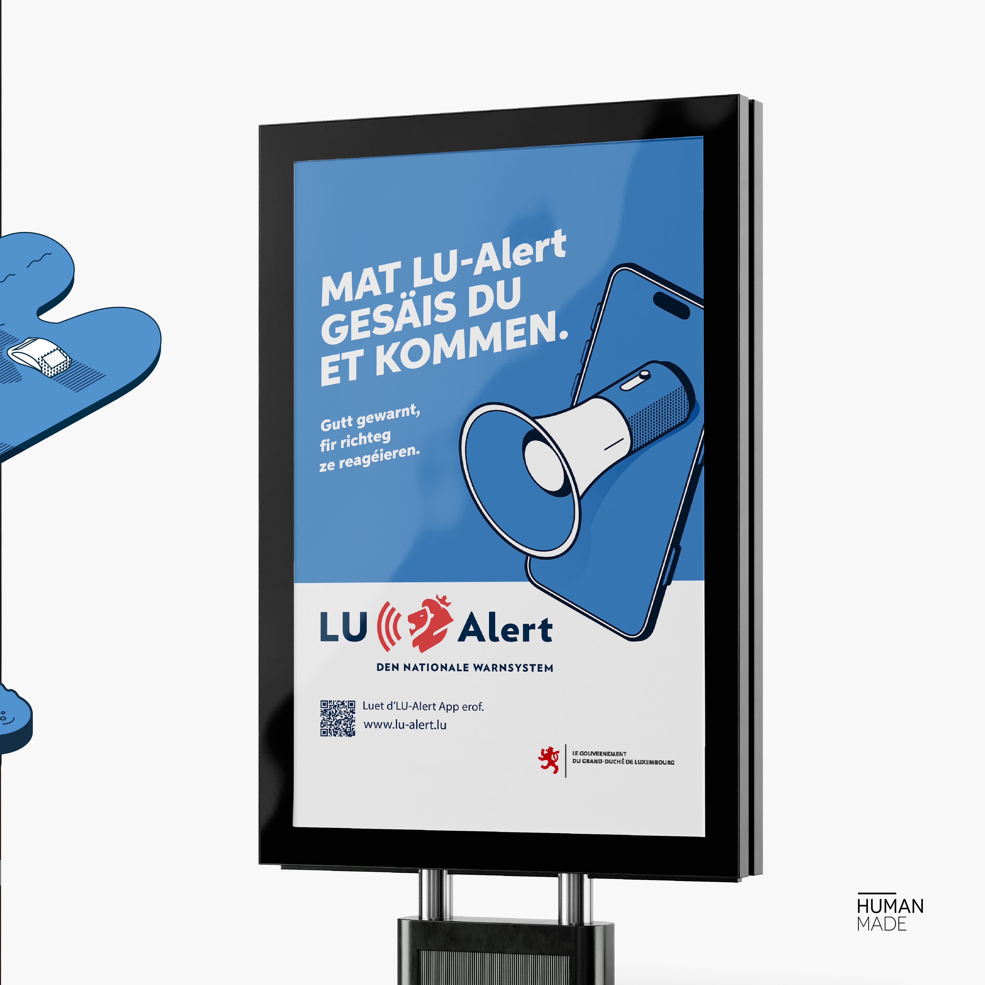
Together with the Comed agency, the first campaign to promote the national warning system was realized and displayed on billboards, buses, newspapers and online advertising.
Visit the webside www.lu-alert.lu
Download the App on App Store
Download the App on Google Play
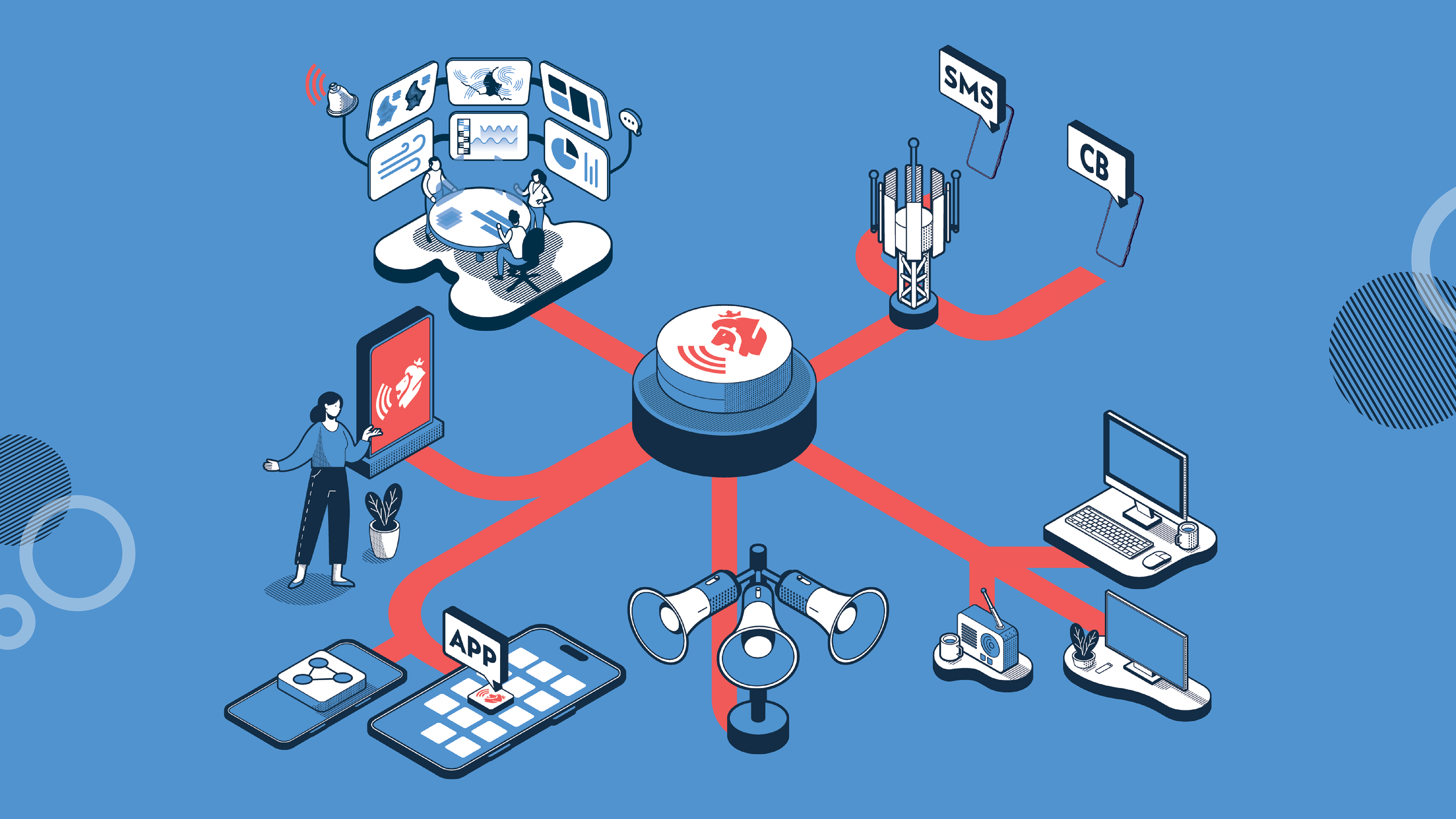
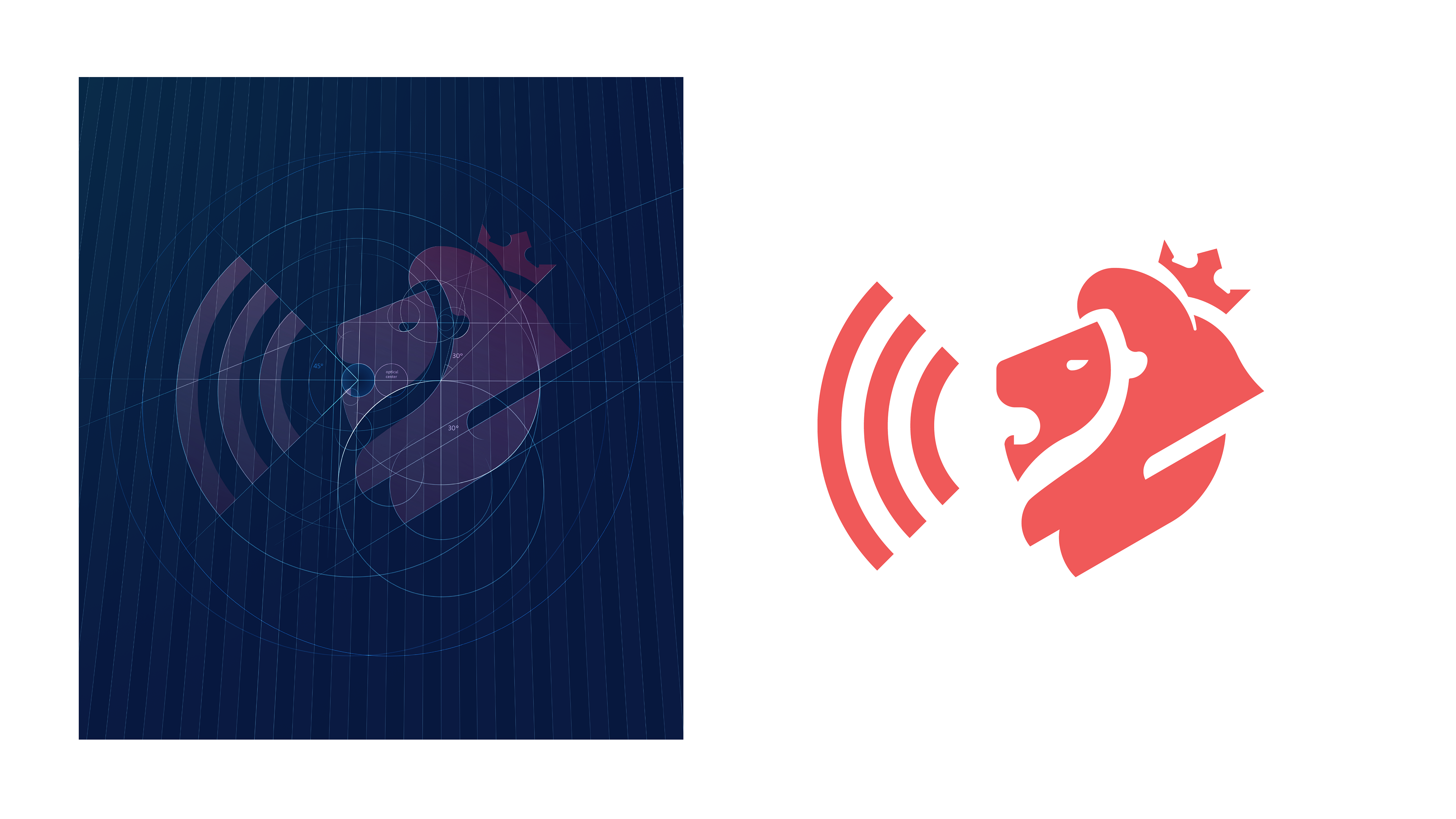
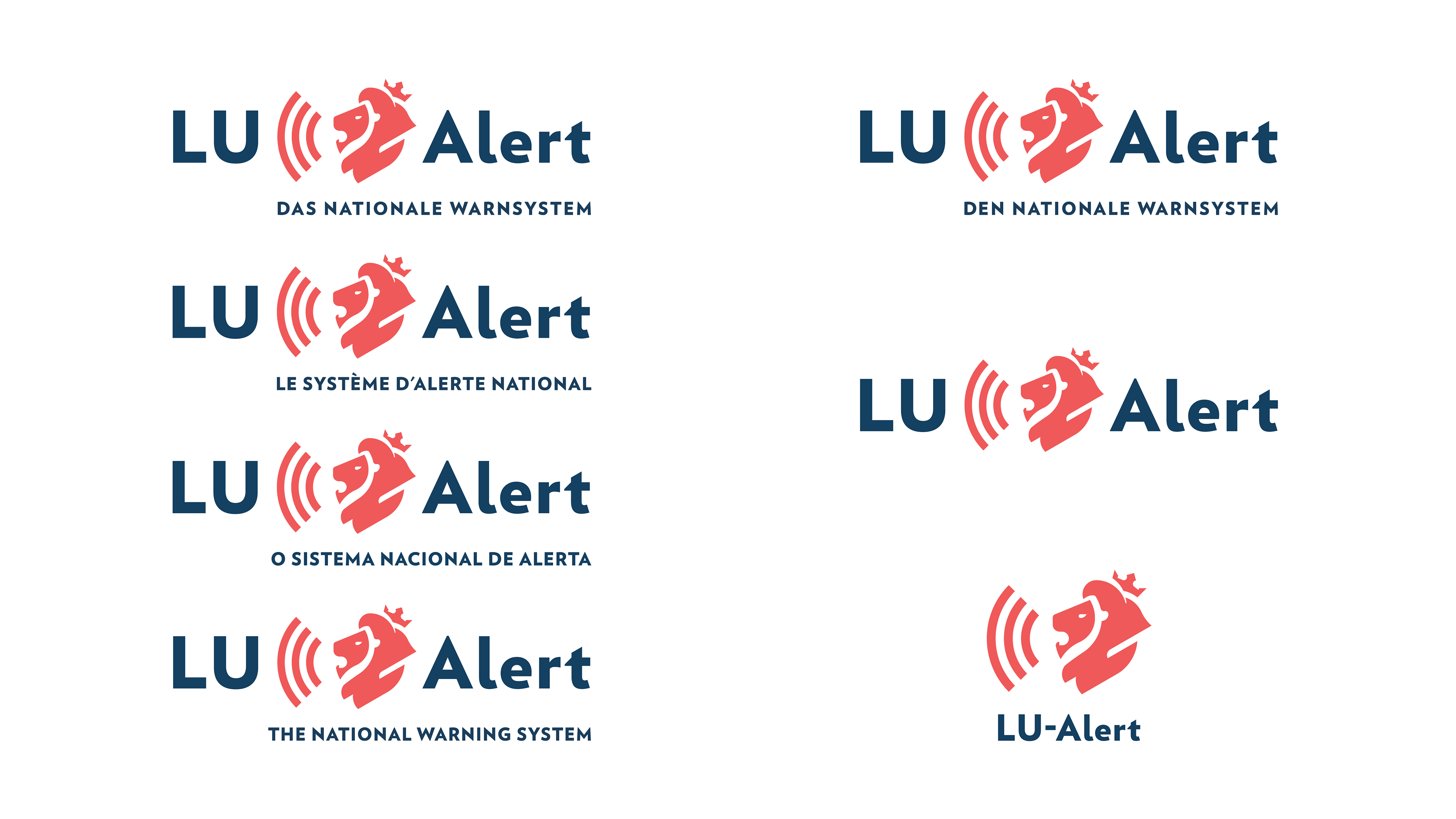
In order to make the warning system known to the population and generate a recognition effect, a logo was first designed. The logo consists of the name of the warning system and the “roude léiw”, which is combined with sound waves. The lion and the choice of a nation branding font should create a link to the Luxembourg state and security institutions such as the police. The sound waves as a graphic element from the communication design stand as a symbol for the various warning signals, in the form of sounds or messages.
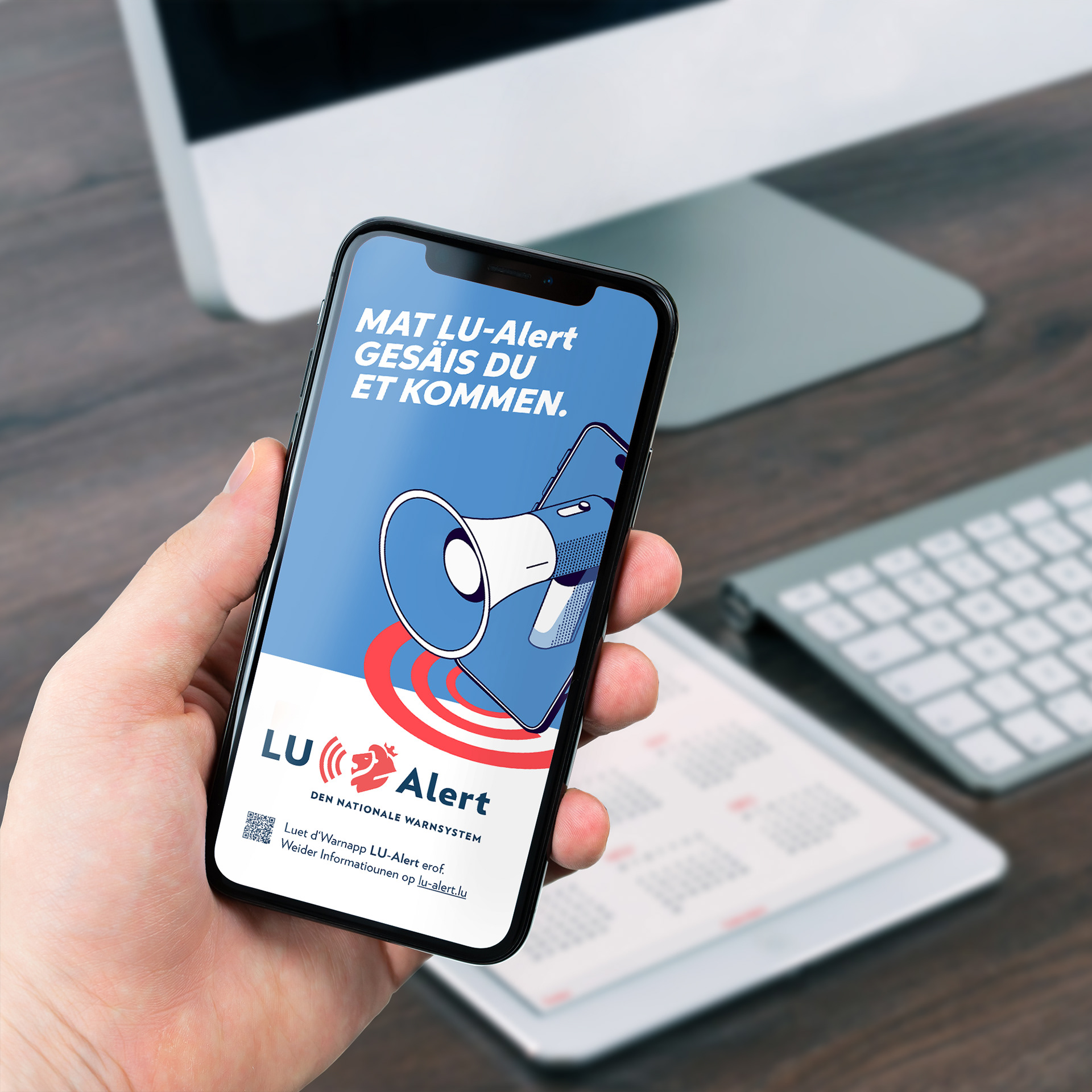
The slogan “Mat LU-Alert gesäis Du et kommen” was developed for the information and awareness campaign to draw attention to the purpose of the warning system. Combined with the subline “Gutt gewarnt, fir richteg ze reagéieren”, which is available in five languages - LU, DE, FR, EN, PT - it makes clear: LU-Alert warns of upcoming disasters in good time so that the population can prepare for them effectively.
Add - Mockup
Phone Add Mockup
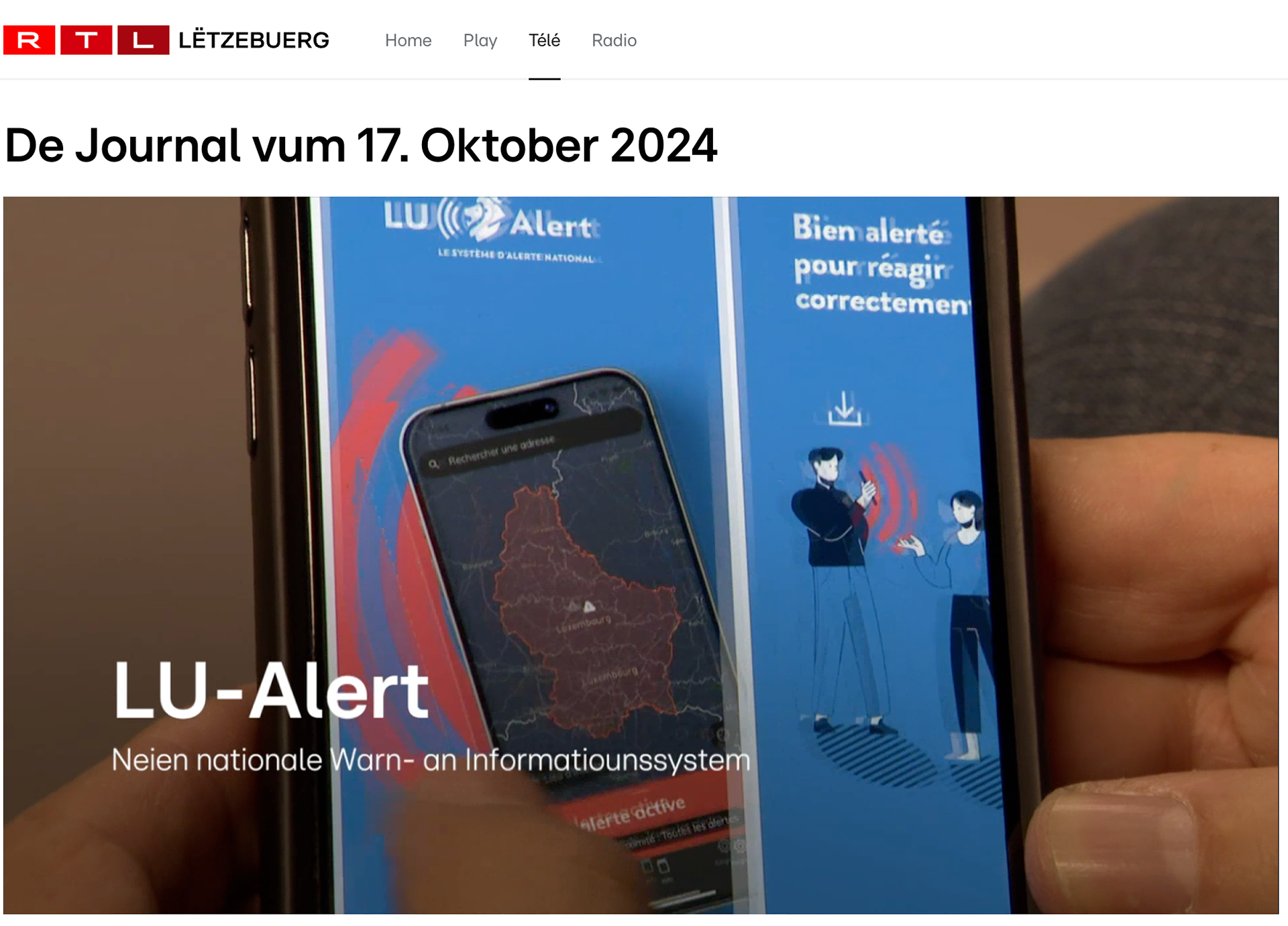
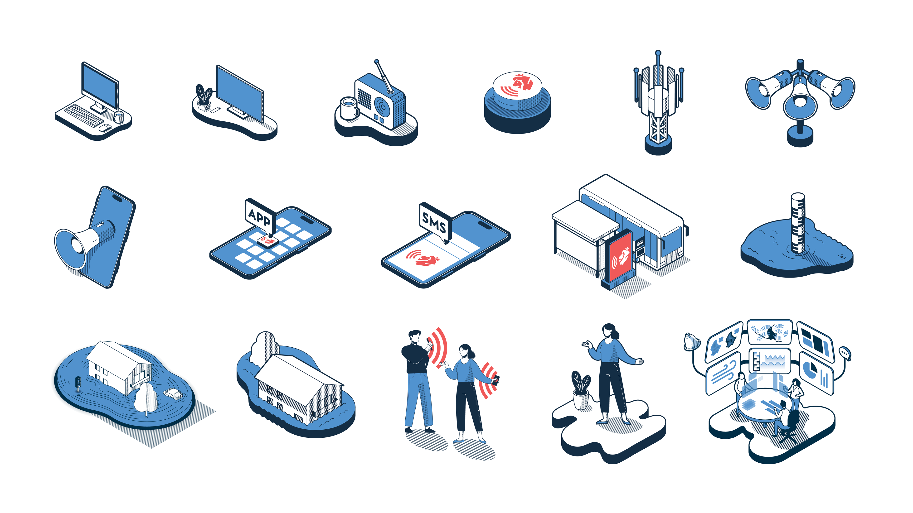
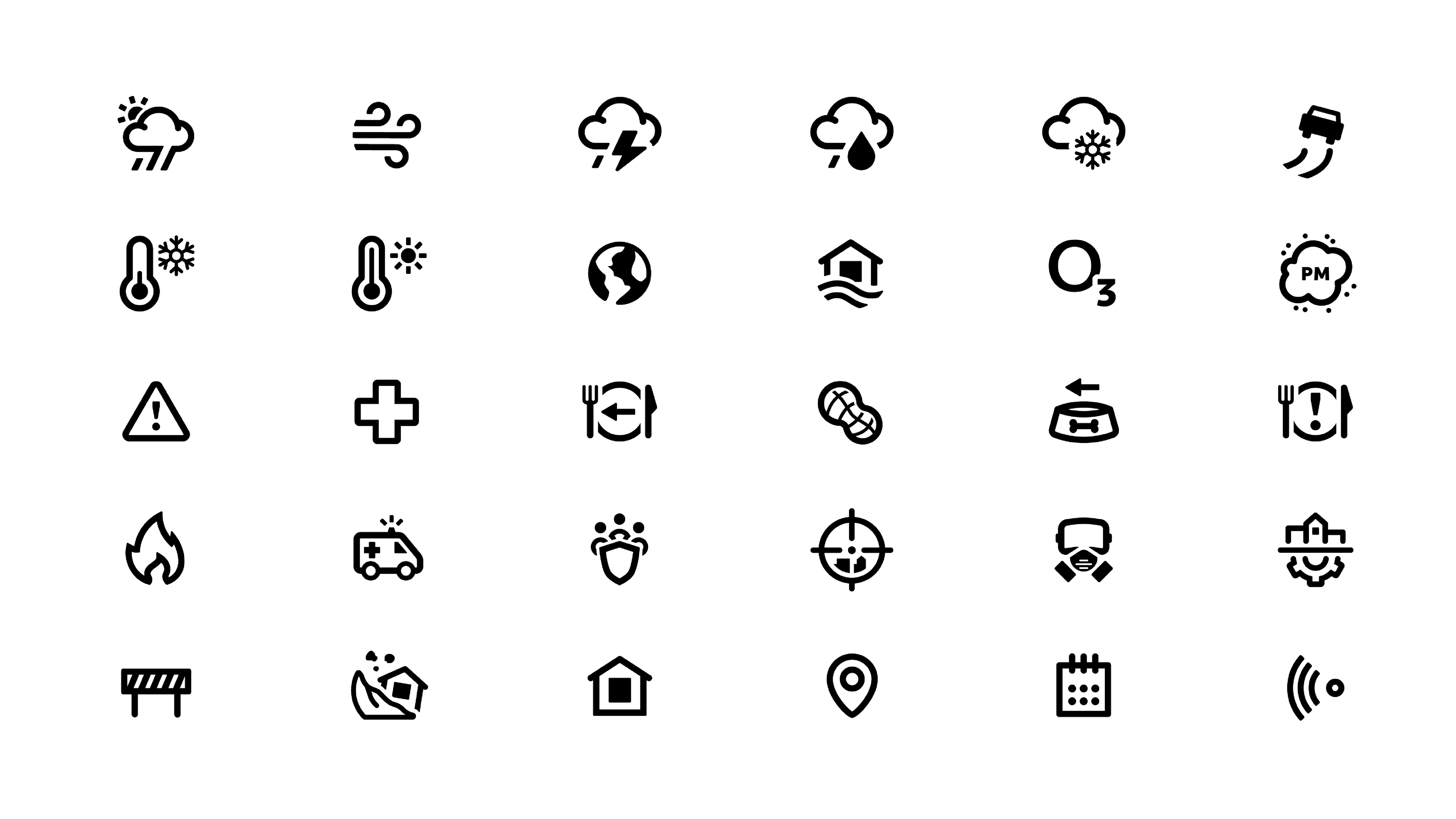
Most of the work consisted of creating illustrations and icons that are used for communication. A total of 32 icons were created, which are used in the app, for example, but also for other means of communication.
The numerous illustrations used to communicate information were drawn in isometric style. This enables a spatial representation in which all objects remain easily recognizable. They are used in explanatory infographics as well as in all other areas of the information and awareness-raising campaign. All illustration elements are based on the colors red and blue, which on the one hand are based on Luxembourg's national colors and on the other hand each serve their own purpose. The red serves as a signal color to convey the importance of the warning. In contrast, the chosen blue stands for coolness and relaxation and is intended to make the infographics and other illustrations appear calm despite the red elements.